When you drive somewhere new, the GPS looks at "road data" — which routes have traffic, which ones are clear
Then it "recommends" the best route for you
Technical Analysis is like a Trader's GPS!
We look at "past price data" and then "recommend" where the price is likely to go 🗺️
But remember — GPS can be wrong sometimes. TA is the same. It is about "probabilities" not guarantees!
What is Technical Analysis?
Technical Analysis (TA) is the study of past price charts to predict future price direction.
The underlying principle is: Human behavior tends to repeat — when price reaches a level where people have previously bought/sold heavily, similar events tend to happen again.
1. Price reflects everything — News, sentiment, everything is already in the price
2. Price moves in trends — Uptrends tend to continue up, downtrends tend to continue down
3. History tends to repeat — The same patterns occur again and again
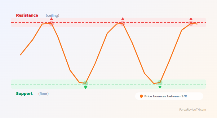
Support and Resistance
The most fundamental and most important tool in TA!
The floor = Support — You stand on it, you do not fall through
The ceiling = Resistance — You jump up and hit the ceiling, you cannot go higher
Price behaves like you in that house — it bounces between the floor and ceiling!
🟢 Support
- A price level where buyers tend to step in and "support" the price
- Price often stops falling or bounces back up at this point
- Like a "floor" that prevents the price from dropping further
- The more it is tested, the stronger it becomes
🔴 Resistance
- A price level where sellers tend to step in and push the price down
- Price often stops rising or bounces back down at this point
- Like a "ceiling" that prevents the price from climbing higher
- The more it is tested, the stronger it becomes
When Resistance is broken → It often becomes Support
This is called "Role Reversal" — the floor becomes the ceiling, the ceiling becomes the floor!
Trendlines
Lines drawn connecting key points to show the direction of price movement.
📈 Uptrend
- Draw a line connecting higher lows
- Price makes Higher Highs and Higher Lows
- Look to Buy when price pulls back to the trendline
📉 Downtrend
- Draw a line connecting lower highs
- Price makes Lower Highs and Lower Lows
- Look to Sell when price rallies up to the trendline
➡️ Sideways (Range)
- Price moves in a narrow range without clear direction
- Buy at support, Sell at resistance
- Or wait for a breakout in either direction
Trading with the trend has a higher success rate than trading against it
Indicators
Indicators are like "assistants" that help confirm whether what you see on the chart is correct. They calculate from price data and display the results as lines or numbers for easy reading.
1. Moving Average (MA)
If temperature is above 37 degrees C = you have a fever
If price is above the MA line = the trend is up
MA helps "smooth out" the choppy price action so you can see the direction more clearly
- SMA (Simple MA) — Simple average, weighs all prices equally
- EMA (Exponential MA) — Gives more weight to recent prices, reacts faster than SMA
How to use:
- Price above MA → Uptrend
- Price below MA → Downtrend
- Golden Cross — Short MA crosses above long MA → Buy signal
- Death Cross — Short MA crosses below long MA → Sell signal
SMA 200 is considered the key dividing line between bull and bear markets
2. RSI (Relative Strength Index)
A runner who has been running for a long time will eventually get tired and need a rest
• RSI > 70 = Very tired (Overbought) → May need to rest = price may drop
• RSI < 30 = Well rested (Oversold) → Ready to run again = price may rise
But elite runners can keep going even when tired — just like a strongly trending chart can keep RSI above 70 for a long time!
RSI ranges from 0-100 and indicates whether the price has been "overbought" or "oversold"
- RSI > 70 → Overbought → May reverse down
- RSI < 30 → Oversold → May reverse up
- RSI = 50 → Neutral, no clear signal
In a strong uptrend, RSI can stay above 70 for a very long time
Always use it together with other signals — RSI is a "clue" not the "answer"
3. MACD (Moving Average Convergence Divergence)
MACD Line = Current speed
Signal Line = Average speed over time
Histogram = Is the car accelerating or braking?
If current speed > average speed = car is accelerating = price is likely to continue!
MACD tells you the "momentum" of the price — is the force behind the price strengthening or weakening?
Components:
- MACD Line — EMA 12 minus EMA 26 (default settings)
- Signal Line — EMA 9 of the MACD Line
- Histogram — Bar chart showing the difference between MACD and Signal
How to read:
- MACD crosses Signal upward → 🟢 Buy signal (Bullish Crossover)
- MACD crosses Signal downward → 🔴 Sell signal (Bearish Crossover)
- Histogram is positive and growing → Strong bullish momentum
- Histogram is negative and growing → Strong bearish momentum
Divergence
When price and an indicator move in opposite directions, it may signal that the trend is about to change.
- Bullish Divergence: Price makes a new Low but RSI/MACD does not → may reverse up
- Bearish Divergence: Price makes a new High but RSI/MACD does not → may reverse down
Combining Tools Together
Do not rely on a single tool! Use multiple tools to confirm each other:
- Identify the trend first — Use Trendlines and MA
- Find S/R levels — Look at Support/Resistance
- Wait for confirmation — RSI, MACD, candlestick patterns
- Enter when multiple signals align
1. MA shows uptrend ✓
2. Price pulls back to Support ✓
3. RSI at 35 (near Oversold) ✓
4. Hammer forms at support ✓
→ A strong Buy signal!
Summary
- Support/Resistance — The most fundamental tool
- Trendlines — Show price direction
- Moving Average — Identify trends and crossover signals
- RSI — Detect Overbought/Oversold conditions
- MACD — Read momentum and trading signals
- Use multiple tools to confirm each other